An interesting method in simulation and modeling is the Monte Carlo simulation. Wikipedia describes them best:
Monte Carlo methods can be used to solve any problem having a probabilistic interpretation. Methods vary, but tend to follow a particular pattern:
1. Define a domain of possible inputs
2. Generate inputs randomly from a probability distribution over the domain
3. Perform a deterministic computation on the inputs
4. Aggregate the results
In this case, I will create a Monte Carlo simulation to evaluate whether one should attack or defend in the board game Risk. Risk has interesting probabilistic rules related to the results of dice rolls that make it a good candidate for simulation. If you’re not familiar with the logic, it can be found here.
The Most Common Dice Scenario
In my experience, the most common scenario is 3 attack die against 2 defense die. So the first order of business is to simulate that scenario for multiple rolls of the die. The goal is to understand whether attacking or defending with the aforementioned die yields the best results.
Here are the results from 200 simulations of 100 rolls of 3 attack and 2 defense die:
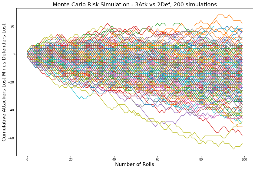
The y axis label is not intuitive, negative means that more defenders were lost than attackers. Positive means that more attackers were lost than defenders. It is not obvious whether or not it is better to attack or defend from this plot, but the general trend does seem to be downwards, which means that more defenders are being lost generally. It may be easier to see the trend with a flat line at 0, where the number of defenders and attackers lost is equal.

How about longer simulations to track the trend over more rolls.
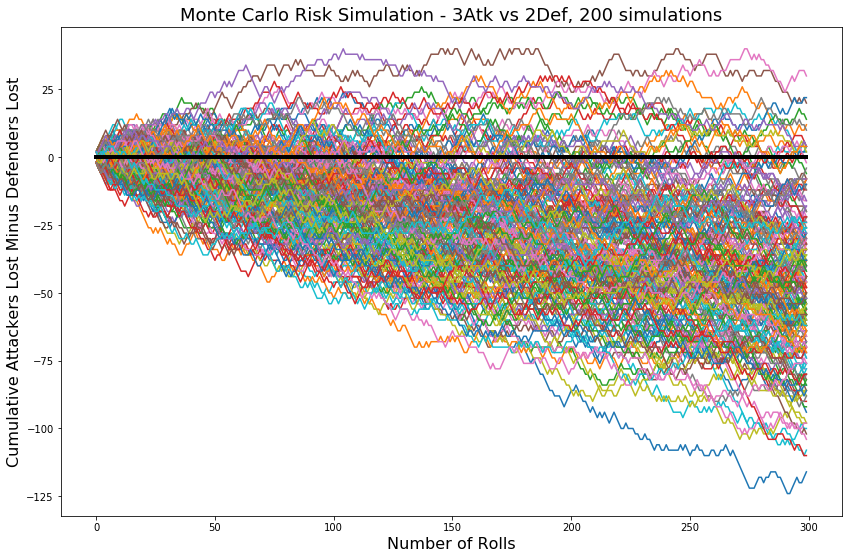
This plot makes it more clear that 3 attack die have the edge over 2 defense die in the long run, but is it better or worse than 2v1 or 1v1, and by how much? We can get a better idea with a kernel density estimation plot.
Kernel Density Estimation
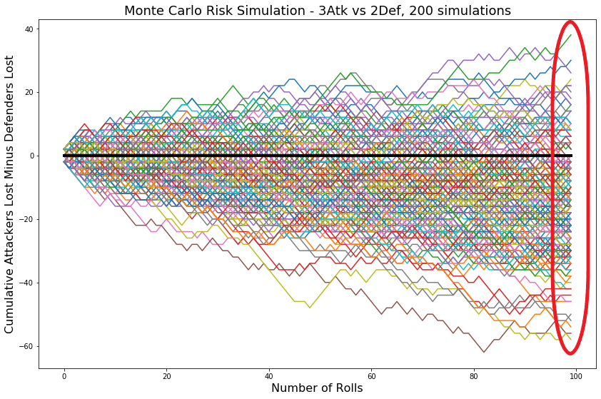
A kernel density estimation is like a smoothed histogram. a useful KDE for risk die rolling would show the distribution of simulations at the end of rolling, circled here:
The KDE plot looks like this:
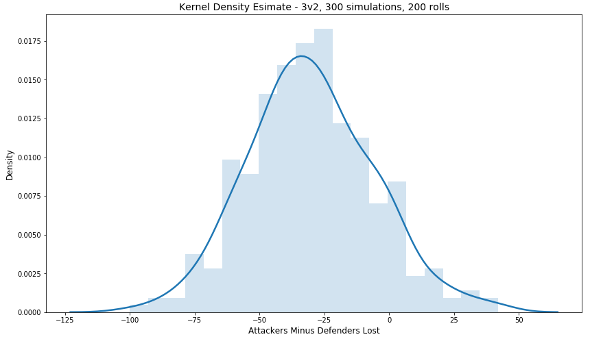
Based on the above KDE, after 200 rolls, the defender will ‘usually’ lose around 30 more units than the attacker.
This could be made useful by generalizing the results to any number of rolls for any possible dice scenario. To accomplish this, the x-axis could have proportions of attackers over defenders lost. This gives likelihoods of outcome without assigning the curve to a specific number of rolls.
Here is an example for 3 attack versus 2 defense dice:
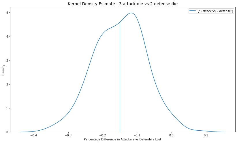
To get an intuition for the x axis, if the majority of the area under the curve is below zero, then the defender is losing more units than the attacker. The more negative, the worse the defender is likely to fare. The above plot shows that in general the attacker will fare better than the defender. The vertical blue line indicates the mean of the data. Here is the equation that creates the data for the KDE:
$$ \frac{cumulative\:attackers\:lost\:-\:cumulative\:defenders\:lost}{number\:of\:rolls} $$
For all possible dice scenarios:
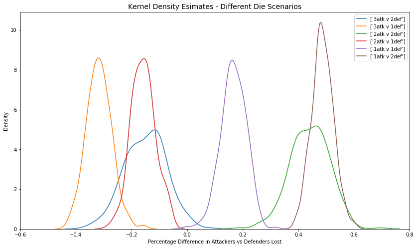
From the above plot, it is possible to deduce the probability of outcome when attacking or defending in each dice scenario. notice that the distributions get more narrow as the possibilities of outcome is more narrow. An example interpretation: 1 attack vs 2 defense die results in the attacker losing between 40 and 60% more units than the defender.